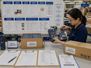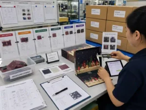
Quick answer: To check advent calendar box printing quality, compare the finished sample with the approved artwork, dieline, color reference, finishing specification, and signed pre-production sample under controlled lighting. Inspect solid colors, small text, registration, barcode readability, foil position, embossing depth, lamination, glue areas, folds, drawer fronts, door edges, and alignment across adjoining panels. Test the box fully assembled and loaded because bending, wrapping, die-cutting, and insert pressure can change how printed graphics appear. Buyers should approve measurable tolerances and defect limits before mass production rather than relying on descriptions such as “good color” or “high quality.”
What should buyers define before checking printing quality?
Buyers should define the approved artwork version, target color method, substrate, surface finishing, inspection lighting, acceptable tolerances, and defect classification before evaluating a sample. Without a written reference, printing approval becomes subjective and difficult to enforce during mass production.
The printing specification should match the actual box construction. A rigid box wrapped with printed paper behaves differently from a directly printed folding carton. Drawer boxes, book-style boxes, and door-opening boxes also create different risks around edges, joints, folds, and repeated graphics.
Before reviewing a sample, prepare the following control documents:
- Final artwork files with version number and approval date
- Approved structural dieline showing cut, crease, glue, bleed, and safe zones
- CMYK values or Pantone references for critical colors
- Material specifications, including paper type, thickness, coating, and board grade
- Finishing map for foil stamping, embossing, debossing, spot UV, and lamination
- Barcode, QR code, warning text, recycling mark, and country-of-origin requirements
- Approved digital proof, wet proof, prototype, or pre-production sample
- Written tolerances and defect acceptance criteria
Buyer tip: Ask the supplier to place the artwork version, dieline version, proof date, and finishing specification on the sample approval record. This prevents an outdated file from entering production after several rounds of revisions.
How does box structure affect advent calendar box printing quality?
Structure affects where color changes, graphics distort, and finishing becomes misaligned. Printing should therefore be inspected on a fully converted and assembled box, not only on a flat press sheet.
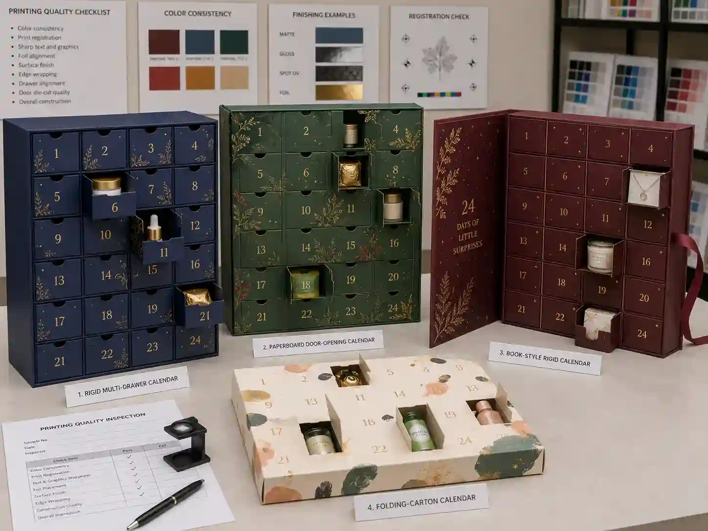
Buyers comparing custom advent calendar box products should examine the printing risks associated with each construction:
| Box structure | Main printing-quality risks | What the buyer should inspect |
|---|---|---|
| Rigid drawer box | Wrapped-paper color variation, uneven turn-ins, shifted drawer-front graphics, visible corner cracking | Alignment across drawer fronts, wrapped edges, corner neatness, repeated numbering, and consistency between drawers |
| Door-opening rigid box | Numbers or illustrations cut by door edges, inconsistent perforation, visible white fibers, misaligned doors | Door position, number centering, perforation cleanliness, image continuity, and opening damage |
| Folding carton calendar | Ink cracking on folds, rubbing, color variation, crease interference, weak registration | Fold lines, locking tabs, glue flaps, perforated doors, high-ink areas, and scuff resistance |
| Book-style or fold-out box | Graphics crossing hinges, spine distortion, magnetic closure pressure, panel-to-panel mismatch | Spine artwork, hinge clearance, matched images across panels, and closure alignment |
| Multi-layer calendar | Color differences between components printed in separate batches or on different materials | Color consistency among sleeves, drawers, trays, covers, and internal printed panels |
Graphics crossing a fold, hinge, drawer gap, or door cut require additional tolerance. A continuous illustration may look correct in the artwork file but appear broken after board wrapping and assembly. For important visual elements, allow a safe distance from structural joints or approve an assembled prototype showing the expected interruption.
How should printing be checked for different product applications?
The inspection priorities should reflect what the advent calendar contains and how the finished package will be sold.
- Cosmetics and skincare: Check skin-tone imagery, metallic brand colors, small ingredient text, varnish compatibility, and resistance to rubbing from bottles or tubes.
- Chocolate and food gifts: Inspect dark solid colors, food photography, batch-code areas, warning text, and whether internal food-contact components are separately specified.
- Candles and mini bottles: Check ink and lamination near heavy compartments because insert pressure can bend panels and reveal cracking or whitening.
- Jewelry: Inspect fine lines, small numbers, metallic foil, black coverage, and dust visibility on dark matte surfaces.
- Toys and children’s gifts: Check small safety text, age markings, repeated illustrations, door numbering, and resistance to scratching during repeated handling.
- Tea, coffee, and beverages: Check fine product descriptions, flavor coding, color differentiation, barcode zones, and consistency across many compartment labels.
How should buyers compare CMYK and Pantone color options?
Use CMYK for photographic images and multi-color artwork, and use Pantone spot colors when a critical brand color needs a defined physical reference. Neither method guarantees identical appearance across different papers, coatings, machines, or production dates.
CMYK output is influenced by the printing profile, ink density, paper whiteness, surface absorption, lamination, and press calibration. Pantone colors can also shift after matte lamination, gloss lamination, varnish, or printing on uncoated paper. A color reference must therefore identify both the target color and the final material and finish.
What should be inspected on a color proof?
A buyer should confirm whether the proof is a digital simulation, contract proof, wet proof, or finished sample. These approval tools do not provide the same level of production confidence.
- Check critical colors under consistent neutral lighting.
- Compare the proof with the approved Pantone chip or signed master sample.
- Review neutral grays, skin tones, dark gradients, shadows, and large solid areas.
- Confirm that black text is sharp and not built from unnecessary CMYK separations.
- Inspect whether lamination or varnish changes color depth and contrast.
- Record the accepted reference instead of approving color through a phone photograph.
Factory tip: Color approval should be made on the specified production paper whenever the project contains a sensitive brand color. A proof printed on a bright coated sheet is not a reliable reference for artwork that will be produced on textured, uncoated, kraft, or colored paper.
Which printing defects should buyers inspect on the sample?
Inspect both appearance and function. A visually attractive press sheet can still fail after die-cutting, wrapping, gluing, perforating, folding, drawer assembly, or product loading.
Print registration and image sharpness
Look for colored halos around text, doubled lines, blurred numbers, and misalignment between color separations. Registration errors are especially visible on small white text reversed from a dark background, thin borders, fine illustrations, and graphics positioned close to cut lines.
Solid colors, gradients, and ink coverage
Large dark areas should be checked for streaks, mottling, pinholes, banding, scratches, and uneven density. Gradients should transition smoothly without obvious steps. Compare the cover, drawers, doors, side panels, and sleeves because different components may have been printed on separate press sheets.
Small text and regulatory information
Ingredient information, warnings, product names, compartment numbers, recycling marks, and importer details must remain readable after printing and conversion. Check that text has not moved into a crease, perforation, foil area, or glue flap.
Barcodes and QR codes
Scan codes from several finished samples rather than only from the PDF artwork. Glossy coatings, metallic foil, low contrast, panel curvature, and poor registration can reduce readability. Buyers can review barcode design principles through the official GS1 barcode standards.
Consistency across repeated components
An advent calendar may contain 12, 24, or more drawers, doors, sleeves, or printed labels. Compare the first, middle, and last components from the sample set. Number size, position, color, orientation, and sequence should remain consistent.
How should foil stamping, embossing, spot UV, and lamination be checked?
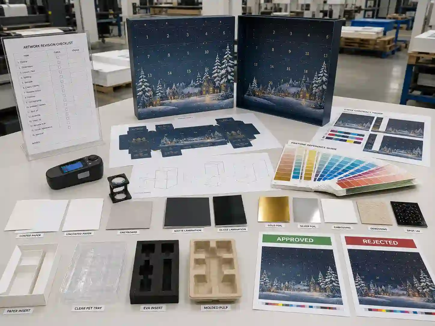
Decorative finishes should be checked for position, adhesion, consistency, edge definition, and compatibility with folds and wrapped corners. Buyers should approve each finish on the final material because a finishing sample card does not show how the process will perform on the actual box.
Foil stamping
Check for missing foil, pinholes, rough edges, excessive pressure, weak adhesion, double images, and foil extending beyond the intended artwork. Foil positioned near a fold, drawer edge, or rigid-box corner requires extra clearance.
Embossing and debossing
Inspect depth, shape, paper cracking, reverse-side marks, and alignment with printed or foiled elements. Excessive pressure can distort thin paper, while insufficient pressure may make the effect inconsistent across a production run.
Spot UV
Check registration against printed graphics, smoothness, curing, dust contamination, cracking, and unwanted gloss variation. Very fine spot UV lines may be difficult to maintain when applied across a large sheet or near creases.
Matte and gloss lamination
Inspect for bubbles, silvering, wrinkles, scratches, edge lifting, uneven adhesion, and color change. Matte lamination can show fingerprints, scuffs, and polishing marks, while gloss lamination can reveal surface waves and glare.
QC tip: Rub two finished surfaces together using moderate hand pressure. This simple comparison can reveal scuffing, foil transfer, weak ink adhesion, or scratching that may occur when flat components, drawers, or completed boxes are packed together.
Why must the insert and product fit be checked during print approval?
The insert can change the appearance and durability of printed panels by pushing against walls, bending drawers, blocking doors, or creating pressure marks. Printing approval should therefore include a fully loaded product-fit test.
Paper inserts, PET trays, EVA inserts, foam, and molded pulp each interact differently with the box. A tight PET tray may bow a folding carton. Dense EVA may place pressure on a rigid drawer. Molded pulp can create dust that is highly visible on dark matte printing.
Load representative products into every cavity and check:
- Whether the outer panels remain flat
- Whether drawers slide without rubbing printed edges
- Whether doors open without tearing printed surfaces
- Whether bottles, jars, jewelry cards, sachets, or accessories contact the printed box
- Whether product weight creates whitening along folds or corners
- Whether insert dust, foam particles, or product residue marks the surface
- Whether compartment numbering remains visible after loading
Buyers can discuss these checks with a custom advent calendar boxes manufacturer before the structural sample and artwork are finalized. Changing the insert after print approval can alter internal pressure, dimensions, and panel alignment.
Which sample should be approved before mass production?
For a print-sensitive project, approve a finished pre-production sample using production-equivalent materials, artwork, structure, and finishing whenever practical. A white prototype confirms dimensions, but it cannot confirm color or finishing quality.
| Sample type | What it can confirm | What it cannot reliably confirm |
|---|---|---|
| Digital rendering | General artwork placement and concept | Physical color, material texture, assembly, finishing, and tolerances |
| White structural prototype | Size, opening method, compartment layout, insert fit | Production printing, color, lamination, foil, and final visual appearance |
| Digitally printed sample | Artwork scale, text, approximate color, assembled appearance | Exact offset-print color and some production finishing effects |
| Wet proof or press proof | Closer color evaluation on specified material | Full assembly performance unless converted into a complete box |
| Pre-production sample | Structure, printing, finishing, insert, assembly, and packing reference | Variation across the full production quantity |
Approval should include signed photographs, measurable comments, and an approved sample retained by both buyer and supplier. Avoid comments such as “make it more premium.” State whether color, foil position, scratch resistance, registration, or assembly needs correction.
How should buyers set printing tolerances and QC criteria?
Define tolerances according to the artwork risk, box structure, selling price, and inspection method. Requirements should be strict enough to protect the brand but realistic for paper printing, die-cutting, wrapping, and manual assembly.
A useful inspection agreement separates defects into critical, major, and minor categories:
- Critical defects: Wrong artwork, missing legal information, unreadable mandatory text, incorrect product identity, unsafe contamination, or mixed versions.
- Major defects: Large color deviation, severe registration error, missing foil, peeling lamination, wrong numbering, unusable barcode, visible glue, damaged graphics, or major panel misalignment.
- Minor defects: Small scuffs, slight finish variation, limited edge marks, or small alignment differences that do not affect function or normal shelf presentation.
Specify the inspection distance, lighting, sample size, approved reference, and whether defects are judged on primary display surfaces or hidden internal areas. A one-millimeter shift may be acceptable on a hidden insert but highly visible around a centered drawer number.
Practical printing-quality checklist for buyers
- Correct artwork and dieline versions used
- CMYK and Pantone references recorded
- Color checked on final paper and finish
- Text, numbers, symbols, and barcodes readable
- Registration acceptable on fine graphics
- Solid colors free from severe streaks or mottling
- Drawer, door, and panel graphics correctly aligned
- Foil complete and positioned within tolerance
- Embossing or debossing aligned and consistent
- Spot UV clean, cured, and correctly registered
- Lamination free from lifting, bubbles, and severe scratches
- Folds and wrapped corners free from unacceptable cracking
- Glue and assembly do not stain printed surfaces
- Loaded inserts do not deform printed panels
- Multiple samples show acceptable consistency
- Approved sample and inspection record signed
How can buyers compare advent calendar box suppliers?
Compare suppliers by the clarity of their technical process, not only by unit price or sample appearance. A reliable supplier should explain how artwork, color, structure, finishing, mass-production inspection, and packing will be controlled.
Use this decision guide:
- Ask how artwork is checked. The supplier should review bleed, resolution, fonts, overprint, black settings, finishing layers, and dieline alignment before output.
- Ask what proof will be supplied. Confirm whether it is a PDF proof, calibrated digital proof, wet proof, finished sample, or pre-production sample.
- Ask how color is controlled. Determine whether critical colors are approved by Pantone reference, signed sample, or measurable target.
- Ask how finishing is inspected. Request inspection criteria for foil, embossing, spot UV, and lamination.
- Ask how components are matched. Multi-drawer calendars may require several print sheets and assembly batches.
- Ask what happens after a defect is found. The supplier should have a documented correction, reinspection, and approval process.
- Ask for packing details. Printing can be damaged after QC if drawers, boxes, or accessories rub during export shipping.
Review the supplier’s communication speed, revision control, sample records, production updates, and willingness to state limitations. Information about the Giftpackpro packaging factory and available custom advent calendar box services can help buyers understand the development and production process before placing an order.
How do MOQ, cost, and lead time affect printing decisions?
MOQ, cost, and lead time are affected by the printing method, box structure, number of components, finishing processes, proof requirements, and material purchasing quantities. A design with many drawer sizes, several foil colors, and individually printed components generally requires more setup and inspection than a single printed sleeve.
Important cost and schedule drivers include:
- Number of printing plates, spot colors, and press sheets
- Paper size, paper grade, and custom material requirements
- Quantity and size of drawers, doors, sleeves, and labels
- Separate dies for foil, embossing, spot UV, die-cutting, and inserts
- Manual wrapping, drawer assembly, numbering, and product loading
- Wet proofs, color matching, prototypes, and pre-production samples
- Inspection level, sorting, replacement allowance, and packing method
- Peak-season capacity and approval delays
A low quotation may exclude wet proofs, special Pantone matching, individual protective packing, replacement components, or third-party inspection. Buyers should compare quotation scope line by line instead of comparing only the final unit price.
How should finished printing be protected during export packing?
Export packing should prevent rubbing, moisture exposure, corner impact, compression, and movement inside the master carton. Printing quality is not fully protected until the boxes arrive at the buyer’s warehouse in acceptable condition.
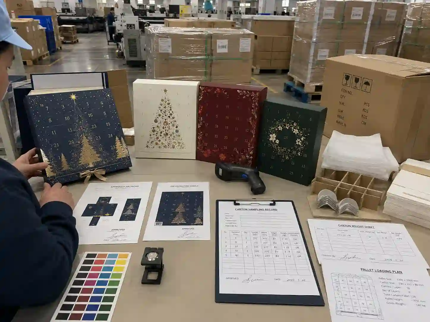
Depending on the finish and structure, protection may include tissue sheets, paper sleeves, polybags where permitted, protective pads, drawer restraints, partitions, corner protectors, reinforced export cartons, and pallet stretch wrap. Matte black boxes and metallic foil surfaces often need more separation than light-colored gloss-laminated cartons.
Ask the supplier to confirm:
- Units per export carton
- Carton dimensions, gross weight, and net weight
- Internal protection and orientation
- Carton board strength and closure method
- Shipping marks and barcode-label positions
- Pallet dimensions and stacking pattern
- Moisture protection for the shipping route
- Whether packed-product or carton testing is required
For projects requiring formal distribution testing, buyers can discuss appropriate procedures with their logistics provider or refer to the official International Safe Transit Association. The selected test should match the actual packed configuration and distribution route rather than being treated as a generic certificate.
QC tip: Inspect several boxes after they have been packed, compressed, and unpacked. Tissue marks, foil rubbing, drawer movement, and corner abrasion may not appear during open-table inspection.
What information should be prepared for an accurate quotation?
A complete RFQ should describe the physical package, printing expectations, inspection level, and export packing. Clear inputs reduce quotation assumptions and make supplier comparisons more meaningful.
Prepare:
- Required quantity and expected reorder volume
- Target delivery date and destination country
- Box style, finished size, and compartment count
- Product dimensions, weights, photographs, and orientation
- Preferred insert material and retention requirements
- Artwork files or reference design
- CMYK, Pantone, foil, embossing, spot UV, and lamination requirements
- Paperboard, greyboard, or sustainability preferences
- Required prototype, color proof, and pre-production sample
- Printing tolerances and inspection expectations
- Export-carton, pallet, shipping-mark, and labeling requirements
- Whether the supplier will pack products or supply empty boxes
Where responsible material sourcing is required, ask the supplier to verify the scope and validity of any claim rather than relying on a logo alone. Buyers can learn about chain-of-custody verification from the official FSC chain-of-custody information.
What common printing-approval mistakes should buyers avoid?
The most common mistake is approving artwork digitally without checking a physical, assembled, and loaded sample. Screen colors, renderings, and isolated finishing swatches cannot show every production risk.
- Approving color from a phone or uncalibrated monitor
- Failing to identify the final artwork and dieline version
- Checking printing before the insert and products are loaded
- Placing small numbers too close to door cuts or drawer edges
- Expecting identical color across different papers and finishes
- Using large dark matte areas without considering scuff visibility
- Adding foil or spot UV across folds and wrapped corners without testing
- Ignoring barcode testing on the finished coated surface
- Changing materials after color approval
- Approving one sample without defining mass-production variation
- Comparing quotations that include different proof and QC scopes
- Using weak export packing that damages approved surfaces in transit
Frequently asked questions about advent calendar box printing quality
Can a digital proof approve the final printing color?
A digital proof can confirm content, scale, positioning, and approximate color, but it may not represent the exact production ink, paper, lamination, or finishing result. Critical brand colors should be approved using a suitable physical reference.
Should buyers use CMYK or Pantone for an advent calendar box?
Use CMYK for photographs and multi-color designs. Consider Pantone for critical solid brand colors or when consistent identification is more important than minimizing setup cost. Many projects use both methods.
Why does the printed color change after lamination?
Lamination changes light reflection and perceived ink density. Gloss lamination can increase contrast and saturation, while matte lamination may soften colors and alter dark areas. Approve color with the specified final finish whenever possible.
How many samples should be checked during production?
The sampling plan should reflect order quantity, risk, defect history, and buyer requirements. Check samples from different cartons and production stages rather than inspecting only units selected from one location.
Is a pre-production sample identical to every mass-production box?
No. It is the approved target reference, but normal printing and assembly variation can still occur. Written tolerances and production inspection are required to determine whether variation is acceptable.
Can printing be approved before the insert is finalized?
Artwork can be developed earlier, but final approval is safer after the insert and representative products have been tested. Insert pressure and product weight can affect folds, drawer movement, panel flatness, and surface appearance.
What is the best way to compare supplier print samples?
Provide every supplier with the same artwork, material, finishing, structure, and approval criteria. Compare color accuracy, registration, finishing alignment, assembly, loaded-box performance, documentation, packing, and corrective-action process.
Prepare your sample and quotation request
To evaluate advent calendar box printing quality efficiently, send the final or draft artwork, product dimensions, compartment plan, target structure, material preferences, critical color references, finishing requirements, order quantity, delivery date, and export-packing expectations. Giftpackpro can then review the dieline, recommend an appropriate proof or sample route, and identify printing risks before mass production.
Explore additional advent calendar box buying guides, or request a custom quote for a project involving cosmetics, chocolate, candles, jewelry, toys, tea, coffee, beverages, or seasonal gift products.