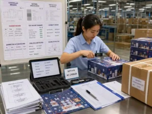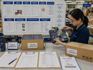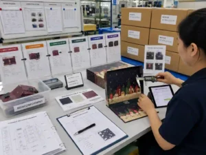
Quick answer: To avoid color differences in custom advent calendar boxes, buyers must control more than the CMYK artwork file. Color can shift because of paper whiteness, greyboard wrapping materials, printing machines, ink batches, lamination, foil stamping, drying conditions, and differences between approved samples and mass production. The most reliable approach is to define Pantone or measurable color targets, approve proofs on the actual production material, keep artwork and material specifications unchanged, and require batch-level color inspection under controlled lighting. When comparing China suppliers, buyers should evaluate their proofing process, color-control equipment, sample-to-production procedures, communication records, and willingness to document acceptable tolerances.
Why do custom advent calendar box colors differ from the approved artwork?
Artwork viewed on a monitor is not a dependable prediction of the final printed box. Screens display color with RGB light, while paper packaging is normally printed with CMYK inks, Pantone spot colors, or a combination of both.
The finished appearance is also affected by the paper surface, coating, lamination, ink density, board construction, and finishing process. A dark red printed on bright white coated paper may look deeper and cleaner than the same ink values printed on warm-white uncoated paper. Matte lamination may reduce visual contrast, while gloss lamination can make dark colors look more saturated.
Common causes of color variation include:
- RGB artwork converted incorrectly to CMYK.
- Different CMYK color profiles used by the designer and printer.
- Paper batches with different whiteness, texture, or absorbency.
- Printing the prototype digitally but producing the order by offset printing.
- Ink-density changes during a long production run.
- Different printing presses used for separate components.
- Matte lamination, gloss lamination, varnish, or spot UV changing the visual result.
- Foil stamping selected from a screen image rather than a physical foil swatch.
- Outer wraps, drawers, doors, and inserts produced at different times without coordinated color control.
- The approved sample being reviewed under warm office lighting while production is checked under standardized lighting.
Buyer tip: Ask the supplier to explain whether the sample and mass production will use the same printing method, paper specification, surface finishing, and color reference. A supplier should identify any unavoidable process differences before sample approval.
Which advent calendar structures create the greatest color-matching risk?
Structures with multiple independently printed components have a higher risk of visible mismatch. The buyer should review not only the front panel but also every door, drawer, sleeve, inner tray, insert, and accessory that must visually match.
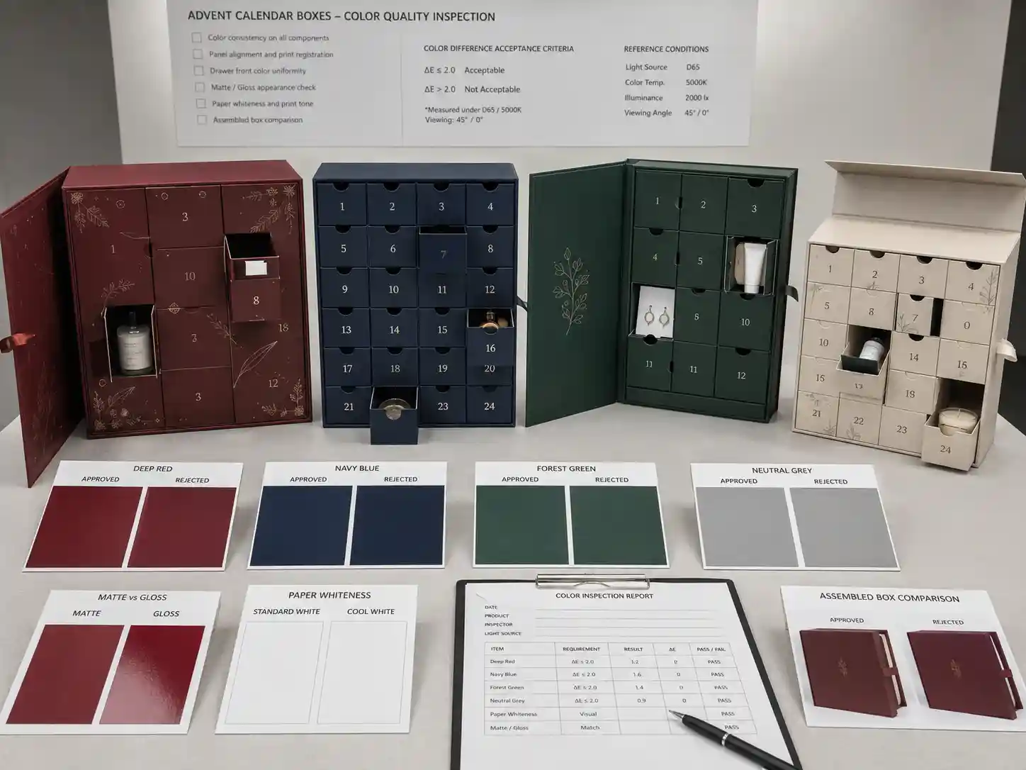
| Packaging structure | Main color risk | Recommended control |
|---|---|---|
| Rigid door-opening box | Wrapped front panel, doors, internal walls, and side panels may use separate printed sheets or production layouts. | Approve a fully assembled sample and require component-to-component color comparison before wrapping. |
| Multi-drawer rigid box | Drawer fronts may appear lighter or darker than the cabinet because they are printed, laminated, or mounted separately. | Gang-print matching components where practical and inspect all drawer fronts together before assembly. |
| Book-style rigid box | Spine, cover wrap, inner panels, and magnetic flap may show changes caused by fold lines, adhesive, or material direction. | Review the complete wrapped structure rather than approving a flat print sheet only. |
| Folding carton calendar | Large solid-color areas may reveal banding, ink variation, cracking, or differences across folded panels. | Confirm paper grain, ink coverage, crease performance, and lamination before mass production. |
| Drawer-and-door hybrid | Multiple printing layouts and assembly stages increase the possibility of inconsistent shades. | Create a component color-control sheet showing which parts must match and which parts may intentionally contrast. |
Large areas of navy, black, burgundy, forest green, or other deep colors often require more careful press control than light backgrounds. Solid colors also reveal scratches, fingerprints, glue marks, scuffing, and lamination defects more easily.
A structure with many small compartments creates another issue: the same printed color may look different when placed beside shadows, recessed doors, exposed greyboard edges, or contrasting inserts. Buyers should evaluate color on a loaded, assembled prototype rather than judging isolated printed sheets.
Should buyers specify CMYK or Pantone colors?
Use CMYK for photographic artwork, gradients, multi-color illustrations, and designs where reasonable process variation is acceptable. Use Pantone spot colors when a critical brand color must remain more consistent across components or production batches.
Neither method eliminates all variation. Pantone printing can improve control of a specific solid color, but the result still depends on paper, coating, ink formulation, drying, and measurement conditions. CMYK can produce attractive commercial packaging, but exact reproduction across different presses and materials is more difficult.
| Color method | Best use | Purchasing consideration |
|---|---|---|
| CMYK process printing | Photography, illustrations, gradients, and artwork with many colors. | Ask for a contract proof or press proof and define tolerance for critical areas. |
| Pantone spot color | Logos, solid brand colors, drawer fronts, borders, and large uniform panels. | Confirm the physical Pantone reference, paper type, and whether the quotation includes spot-color printing. |
| CMYK plus Pantone | Image-heavy packaging that also contains one or more critical brand colors. | Usually adds printing plates, setup work, and cost, but may reduce brand-color variation. |
| Foil color | Metallic logos, borders, numbers, and premium decorative details. | Approve a physical foil swatch because foil appearance cannot be judged accurately from a screen. |
For international color communication, buyers can review physical Pantone references through the Pantone official website. Commercial printing controls may also reference applicable guidance in the ISO 12647 printing standard series, although the exact inspection method should be agreed with the supplier.
Factory tip: Do not send only a screenshot or state that the color should be “luxury red,” “warm gold,” or “close to the previous order.” Provide the artwork file, Pantone code when applicable, physical reference sample, material specification, and acceptable tolerance.
How do paper, greyboard, and inserts affect the final color?
The printed sheet creates the visible color, but the underlying material and surrounding components influence how buyers perceive it. Material specifications must therefore be included in the color-control plan.
For a rigid box, the printed paper is wrapped around greyboard. Variations in paper opacity, board tone, glue application, and wrap tension can affect lighter colors. Thin paper over darker recycled greyboard may appear less bright than the same print over a white backing layer.
For folding cartons, paperboard whiteness and coating are major variables. Coated paperboard normally produces sharper images and stronger ink holdout, while uncoated or textured stock absorbs more ink and creates a softer appearance.
Inserts also change the visual presentation:
- A white paper insert can make surrounding colors appear darker and more saturated.
- A black EVA insert can create strong contrast but may expose dust or adhesive marks.
- A clear PET tray allows the printed background to remain visible but can create reflections.
- Foam inserts may vary slightly by material batch and should not be treated as exact printed-color references.
- Molded pulp has natural texture and shade variation, which should be considered part of the material appearance.
Product fit matters as well. A cosmetic bottle, tea sachet, jewelry card, stationery item, or mini candle may cover part of a printed compartment and alter the perceived balance of the design. The insert should be tested with actual products or dimensionally accurate dummies before final color approval.
What should be checked in the artwork and dieline before proofing?
Buyers should confirm that the artwork is production-ready, assigned to the correct dieline, and supported by a written color specification. Many apparent factory color problems begin with incomplete artwork instructions.
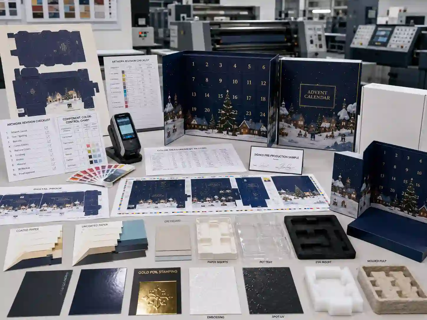
Artwork preflight checklist
- Confirm that all production artwork uses the required CMYK or spot-color setup.
- Remove unintended RGB images and verify embedded image profiles.
- Use the correct dieline revision for the approved structure.
- Check that door numbers, drawer fronts, side panels, and inner graphics are positioned correctly.
- Identify critical brand colors separately from non-critical decorative colors.
- Specify whether rich black or single-color black is required in each area.
- Confirm overprint, trapping, bleed, and knockout settings.
- Provide separate layers for cutting, creasing, perforation, foil stamping, embossing, and spot UV.
- Define matte lamination, gloss lamination, varnish, or uncoated areas.
- Check whether white ink or a white backing layer is needed on colored or transparent materials.
Artwork should also account for the finished structure. A color crossing a hinge, crease, perforated door, drawer edge, or wrapped corner may look different because light reflects from each surface at a different angle. This is not always a printing defect.
Experienced custom advent calendar box services should include dieline review and should flag artwork that is likely to crack, misregister, expose unprinted edges, or create an unrealistic color expectation.
Which proof and sample should a buyer approve?
Buyers should approve color in stages: a digital file check, a printed proof, an assembled prototype, and a pre-production sample when the project risk justifies it. A screen PDF alone is not sufficient for a color-critical order.
Digital proof
A digital proof confirms artwork placement, text, numbering, cutting lines, and basic image content. It is useful for identifying file errors but should not be treated as a final physical color standard.
Printed color proof
A printed proof provides a closer indication of color and finishing. Buyers must ask whether it is produced digitally or by the same offset process planned for mass production. Digital proofs are fast and economical, but they may not match offset ink behavior exactly.
Blank prototype
A blank prototype is primarily for structure, product fit, insert retention, drawer clearance, door opening, and assembly testing. It does not establish final printing color, but it prevents structural revisions from forcing artwork changes later.
Printed assembled sample
The printed sample allows the buyer to review how color appears after lamination, wrapping, die-cutting, folding, gluing, and assembly. It should include representative finishing such as foil stamping, embossing, or spot UV when those processes influence approval.
Pre-production sample
A pre-production sample should use confirmed materials, final artwork, final structure, and intended production methods as closely as possible. The approved sample should be signed, dated, photographed, and linked to the final specification sheet.
Buyer tip: Record comments with specific locations and measurable instructions. “Make the red slightly better” is difficult to control. “Match Pantone 201 C on the approved coated paper, with the signed sample as the visual reference” is more actionable.
How should buyers compare China suppliers for color control?
Do not compare suppliers only by quotation total. Compare how each factory translates the artwork into a controlled production specification and how it manages differences between sampling and mass production.
| Supplier comparison point | What to ask | Positive evidence |
|---|---|---|
| Color communication | How are Pantone, CMYK, proofs, and physical samples recorded? | A written color specification with artwork revision and sample reference. |
| Printing capability | Is printing completed in-house or outsourced, and can the same press method be used for repeat orders? | Clear production routing and responsibility for print approval. |
| Measurement | Are density, color difference, or visual comparisons recorded during production? | Inspection records, calibrated equipment, and defined checking frequency. |
| Component matching | How are drawer fronts, doors, sleeves, and inner panels matched? | Component boards or approved sets compared before assembly. |
| Sample control | How is the signed sample transferred to the production and QC teams? | Sealed samples, specification sheets, revision records, and production sign-off. |
| Communication | Who confirms artwork, material, finishing, and color changes? | A named project contact and written approval procedure. |
| Repeat-order reliability | Which specifications and retained samples are stored? | Documented material codes, color values, production records, and retained references. |
A low quotation may exclude a press proof, Pantone ink, premium paper, color measurement, component matching, or replacement of out-of-tolerance printed sheets. Ask suppliers to state these items clearly.
Buyers can review the capabilities of the Giftpackpro packaging factory, compare relevant custom advent calendar box products, and confirm whether the proposed production method is appropriate for the design rather than assuming every factory quotation covers the same process.
How should an acceptable color tolerance be defined?
The buyer and supplier should agree on how color will be evaluated before production starts. The method may combine an approved physical sample, instrument readings, and visual inspection under controlled lighting.
A practical agreement should state:
- Which colors are critical and which are decorative.
- Whether the Pantone book, signed proof, or physical product is the primary reference.
- Which substrate and lamination are included in the approval.
- The lighting condition used for visual evaluation.
- Whether a measurable Delta E tolerance is required.
- How component-to-component differences will be judged.
- What action is required when printed sheets fall outside the agreed range.
There is no single tolerance suitable for every package. A luxury rigid box with a solid brand color may require tighter control than a folding carton with a multicolor illustration. Very small numerical tolerances can also increase setup time, waste, inspection, and cost.
QC tip: Separate “color difference from the approved standard” from “color difference caused by lighting or surface angle.” Compare samples side by side under the same light, orientation, material, and finish.
What should happen during mass-production color inspection?
Color should be checked at the start of printing, during the run, after finishing, and after assembly. Inspecting only completed export cartons is too late because most color-related value has already been added.
- Incoming material check: Confirm paper type, paper whiteness, greyboard, insert material, lamination film, and foil batch.
- First-sheet approval: Compare initial press sheets with the approved proof or standard before the full run continues.
- In-process checks: Sample sheets throughout the run to identify ink-density drift, contamination, banding, or registration changes.
- Post-lamination review: Confirm that matte or gloss lamination has not created an unacceptable visual shift.
- Finishing inspection: Check foil stamping, embossing, spot UV, die-cutting, and crease areas for alignment and surface consistency.
- Component matching: Place doors, drawers, covers, sleeves, and inner panels together before assembly.
- Assembly inspection: Compare completed boxes with the signed pre-production sample.
- Final random inspection: Review representative units from different cartons and production stages.
For large orders, color samples should come from the beginning, middle, and end of the production run. This is especially important when the box contains large solid-color areas or matching parts printed on separate sheets.
Can export packing cause visible color damage?
Export packing does not normally change printed ink color, but poor protection can create scuffing, abrasion, moisture marks, pressure gloss, rubbing, and surface contamination that buyers may interpret as color inconsistency.
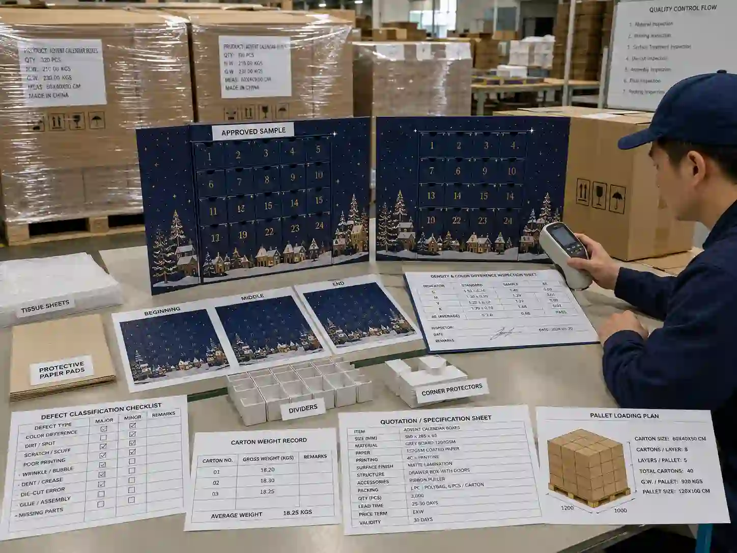
Dark matte-laminated rigid boxes are particularly sensitive to rubbing and fingerprints. Drawer fronts, sharp corners, foil areas, and spot UV surfaces may need tissue sheets, protective paper pads, dividers, sleeves, or individual bags.
Export-packing controls should include:
- Fully dried and cured printed components before packing.
- Tissue or protective sheets between sensitive surfaces.
- Dividers that prevent drawer fronts and box covers from rubbing.
- Corner protectors for rigid structures.
- Reinforced export cartons sized to limit internal movement.
- Carton weight limits appropriate for manual and warehouse handling.
- Clear shipping marks, carton numbers, quantities, and handling symbols.
- Pallet patterns that avoid carton overhang and excessive compression.
- Stretch wrap and top protection suitable for the shipping route.
The quotation should state whether the boxes are supplied assembled or flat packed. Assembled rigid boxes occupy more volume but reduce destination assembly risk. Flat-packed folding cartons save freight space, although folding, locking, and insert placement at the buyer’s facility must be controlled.
How do MOQ, cost, and lead time affect color decisions?
Tighter color requirements generally require more preparation, proofing, press adjustment, inspection, and potential waste. Buyers should include these expectations in the RFQ rather than adding them after the order is placed.
Important cost drivers include:
- CMYK versus Pantone spot-color printing.
- Number of printed components and press sheets.
- Digital proof, contract proof, press proof, or full printed prototype.
- Custom-dyed paper, fabric, ribbon, EVA, or foam.
- Matte lamination, gloss lamination, foil stamping, embossing, and spot UV.
- Tight component-matching requirements.
- Small production quantities with high setup costs.
- Extra inspection, sorting, or replacement allowance.
- Repeat-order matching to an older retained sample.
MOQ should be evaluated by structure and process, not as one universal number. A standard folding carton with CMYK printing may support a different economical quantity from a hand-wrapped rigid drawer box using Pantone colors, foil stamping, custom inserts, and detailed assembly.
Lead time should include artwork confirmation, dieline preparation, blank prototype, printed sample, sample revision, material ordering, mass production, QC, and export packing. Waiting for physical color approval or custom material production can add time, so the approval schedule should be planned before the seasonal launch deadline.
What information should be included in a color-critical RFQ?
A complete RFQ allows suppliers to quote the same scope and reduces later disagreements. Buyers should provide both packaging specifications and color-control expectations.
Quotation preparation checklist
- Box style: rigid box, folding carton, drawer box, book-style box, or door-opening box.
- Finished dimensions and number of compartments.
- Product dimensions, weights, orientation, and fragile areas.
- Insert preference: paper insert, PET tray, EVA insert, foam, or molded pulp.
- Target order quantity and expected repeat orders.
- Artwork files and final dieline status.
- CMYK, Pantone, foil, and critical color references.
- Paperboard, wrapping paper, and greyboard preferences.
- Matte lamination, gloss lamination, foil stamping, embossing, or spot UV requirements.
- Required sample type and approval deadline.
- Acceptable color-evaluation method and tolerance.
- Export destination and required delivery date.
- Assembled or flat-packed delivery preference.
- Export carton, pallet, shipping mark, and barcode requirements.
- Requested payment terms and trade terms.
Ask each supplier to identify assumptions and exclusions. A useful quotation should state structure, dimensions, materials, printing, finishing, insert, MOQ, sample charge, production lead time, packing method, payment terms, and quotation validity.
Which color-control mistakes should buyers avoid?
- Approving color from a phone or uncalibrated monitor.
- Sending RGB artwork without confirming CMYK conversion.
- Changing paper or lamination after sample approval without rechecking color.
- Using a digitally printed sample as an exact offset-printing standard.
- Approving only a flat sheet instead of an assembled box.
- Failing to identify which colors are commercially critical.
- Requesting exact matching without providing a physical or measurable reference.
- Allowing different components to be printed without a matching plan.
- Comparing quotations that use different materials and proofing processes.
- Starting production before the final artwork revision is signed off.
- Ignoring protective packing for dark matte or metallic surfaces.
- Expecting a repeat order to match years later without retained samples and material records.
Decision guide: which color-control level does your project need?
Choose standard commercial control for multicolor promotional designs where small normal production variations are acceptable. Use print-ready CMYK artwork, an approved printed sample, material confirmation, and routine production inspection.
Choose enhanced brand-color control when logos, large solid-color areas, drawer fronts, or door panels must match closely. Add Pantone references, actual-material proofs, component matching, controlled-light review, and documented production checks.
Choose high-control production for premium rigid boxes, luxury retail launches, or repeat programs requiring close batch consistency. Use a pre-production sample, measurable tolerance where practical, retained standards, detailed inspection records, and written approval for material or process changes.
The best option is not always the tightest possible tolerance. It is the level of control that protects the brand while remaining practical for the selected paper, structure, quantity, finishing, lead time, and budget.
Frequently asked questions about color difference advent calendar boxes
Can a factory guarantee zero color difference?
No responsible supplier should promise absolute zero variation across all materials, machines, lighting conditions, and production batches. The practical goal is to define an acceptable standard, control the main variables, and identify out-of-tolerance production before shipment.
Why does the rigid box look different from the folding carton when both use the same artwork?
The two structures may use different papers, printing layouts, coatings, lamination films, and underlying boards. The same CMYK values can therefore produce visibly different results.
Does matte lamination change printed color?
Yes. Matte lamination can reduce gloss, soften contrast, and make some colors appear less saturated. Buyers should approve color after the intended lamination is applied.
Should the insert color match the outer box exactly?
Only when exact matching is necessary for the design. Paper inserts can be printed to coordinate closely, while EVA, foam, PET, and molded pulp have different material limitations. Intentional contrast is often easier to control than an attempted exact match across unrelated materials.
Is a Pantone code enough for mass-production approval?
No. A Pantone code is an important reference, but the buyer should also confirm substrate, coating, finishing, lighting, and physical sample appearance.
How can repeat orders remain consistent?
Keep the final artwork, material codes, Pantone references, production records, approved sample, inspection standard, and finishing specification. Ask the supplier to report any discontinued or changed material before producing the repeat order.
When should a buyer reject a color difference?
Reject or sort production when the result falls outside the agreed reference or tolerance, creates obvious mismatch between adjacent components, or changes a commercially critical brand color. The acceptance method should be agreed before production, not negotiated after shipment.
Prepare your project before requesting a sample or quotation
To reduce color difference in advent calendar boxes, prepare the box style, dimensions, product list, insert requirements, artwork, Pantone or CMYK references, finishing, quantity, color tolerance, packing method, destination, and required delivery date. Include a physical brand-color reference when accurate matching matters.
Giftpackpro can review these details through its custom advent calendar boxes manufacturer capabilities and recommend a suitable proofing, sampling, production, and QC plan. Explore additional advent calendar box buying guides or request a custom quote with your product dimensions, artwork files, target quantity, and color-control requirements.