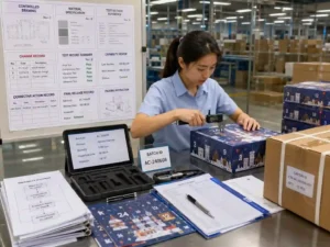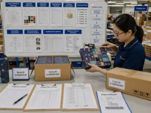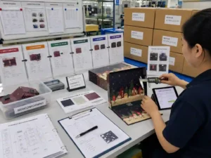
Color differences between an advent calendar’s outer box and internal components usually happen because each part may use different materials, printing processes, surface finishes, or production settings. Effective outer inner component color matching requires controlled artwork files, separated color references, physical proofs, and documented approvals. The goal is not only to make colors look similar on screen, but to verify how the final printed surfaces appear together.

Why Can the Outer Box and Internal Components Show Different Colors?
The outer box and internal components can shift in appearance because they are often produced on different substrates or with different finishing methods. A color printed on coated paper may appear different from the same color printed on uncoated board, textured paper, or an insert material.
Common causes include:
- Different paper brightness, texture, or absorbency.
- Different ink coverage or printing processes.
- Lamination, varnish, or other surface finishes changing visual appearance.
- Artwork files using different color settings between components.
- Viewing conditions affecting perceived color comparison.
How Do You Plan Artwork for Outer Inner Component Color Matching?
Color consistency starts during artwork preparation. The outer structure, drawers, trays, sleeves, and internal paper components should be reviewed as a connected color system instead of separate files.
Packaging teams should confirm:
- Which areas use CMYK, spot colors, metallic effects, or special finishes.
- Whether the same color reference is applied across all related components.
- Where color-critical areas are located within dielines.
- Whether safe areas prevent important graphics from moving into folds, cuts, or glued sections.
Artwork layers should clearly separate printing elements, finishing layers, white ink requirements, and construction information. This helps prepress teams identify whether a color difference comes from artwork preparation or production variation.
What Checks Should Be Included Before Printing?
A preflight review should confirm that all connected components use controlled color information before proofs are approved.
Preflight checklist for color consistency
- Confirm outer box and internal component artwork use the approved color references.
- Check that linked files contain correct profiles and production settings.
- Review dielines to confirm color-critical graphics are positioned correctly.
- Verify barcodes and multilingual copy remain readable after color adjustments.
- Confirm finishing layers are separated from standard printing layers.
- Record revision numbers for approved artwork files.
How Do Physical Proofs Help Verify Component Color Differences?
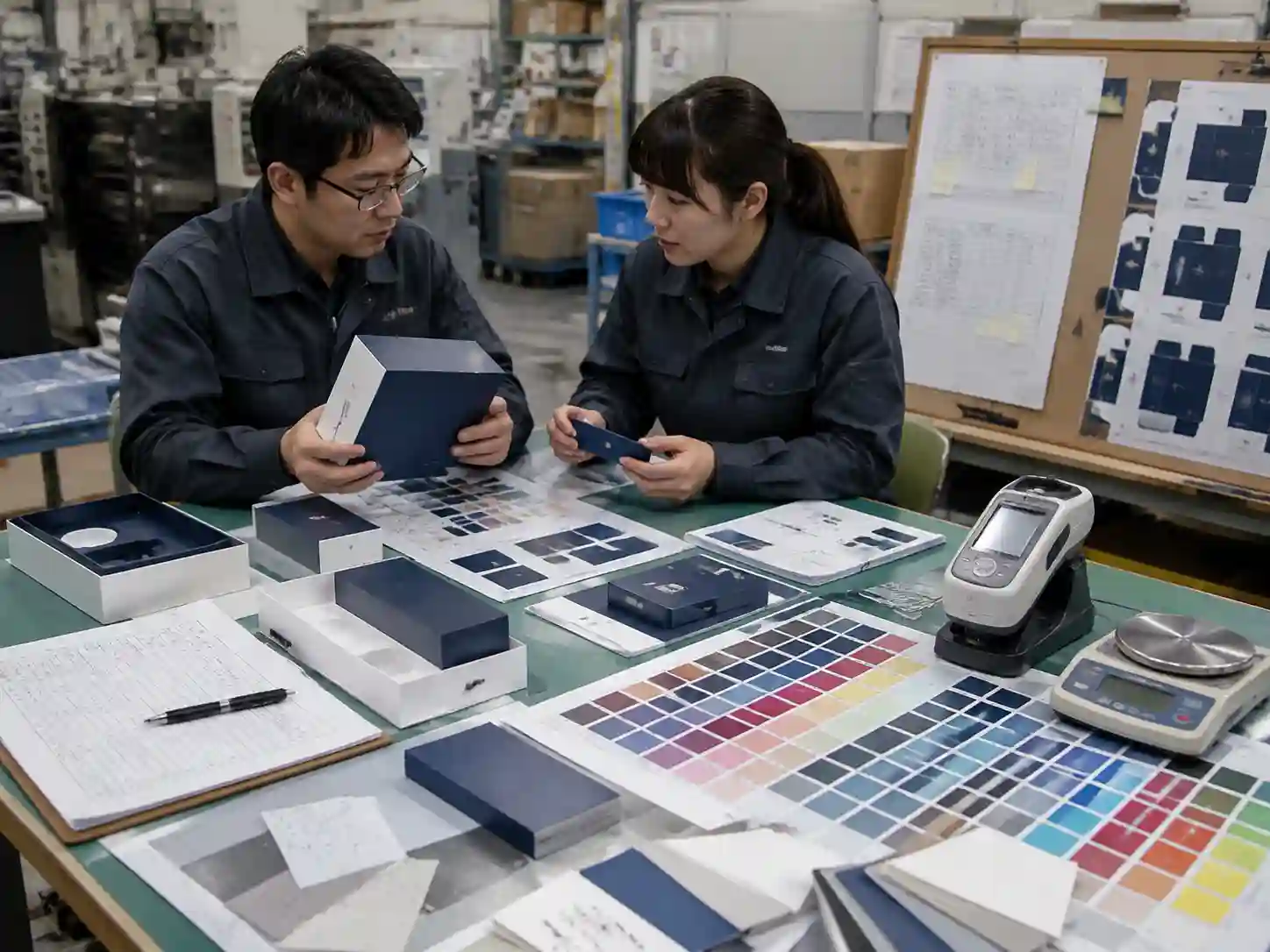
Physical samples are important because digital screens cannot accurately predict every difference caused by paper, coating, texture, or finishing. A printed proof allows teams to compare the outer box and internal components under the same viewing conditions.
The review should focus on:
- Side-by-side comparison of related components.
- Color appearance under controlled lighting.
- Surface effects caused by coating or texture.
- Consistency between visible exterior areas and internal presentation areas.
| Check item | Purpose | Approval evidence |
|---|---|---|
| Color reference | Confirm target color definition | Approved artwork record or color reference sheet |
| Printed proof | Compare actual material appearance | Signed or recorded proof approval |
| Material comparison | Identify substrate-related shifts | Paper or component sample review |
| Final inspection | Confirm production consistency | QC records and inspection notes |
How Do Production Teams Control Color Differences During Manufacturing?
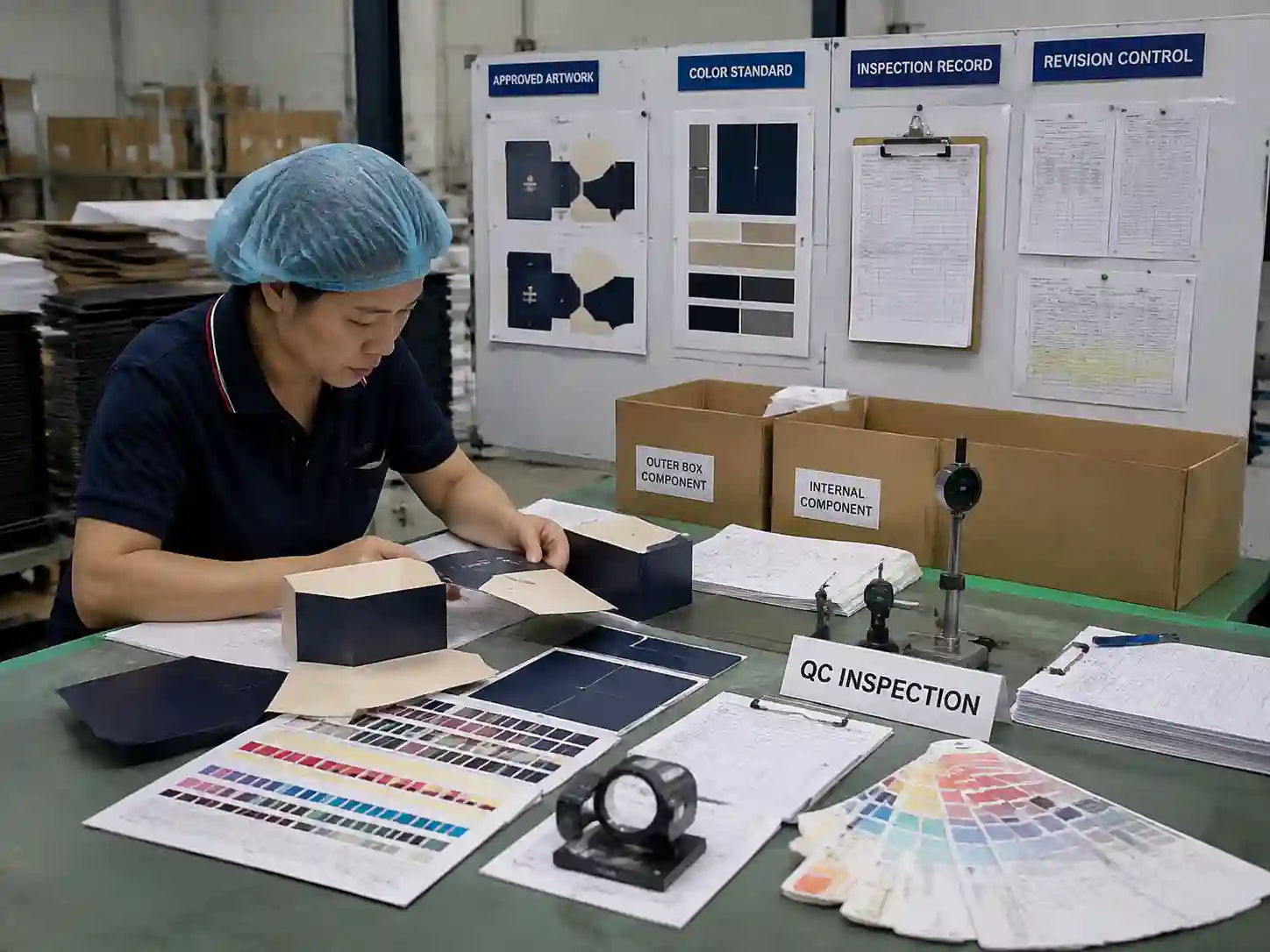
Production teams control color variation by maintaining approved references and checking critical components throughout production. The outer box and internal parts should not be evaluated separately if they are designed to appear together.
Typical production controls include:
- Reviewing approved artwork and sample records before production.
- Checking printed sheets or components against approved references.
- Monitoring changes caused by material substitution or finishing adjustments.
- Recording any approved variation between different component materials.
The acceptable level of difference depends on the project. Some designs require close visual matching between the exterior and interior, while others intentionally use contrasting colors. The required control level should be defined during artwork approval.
What Evidence Should Buyers Request for Color Approval?
Buyers should request documentation that shows how color decisions were reviewed and approved, rather than relying only on verbal confirmation.
Useful approval evidence may include:
- Approved artwork files with revision history.
- Physical proof samples showing outer and internal components together.
- Color comparison records.
- Production inspection notes.
- Supplier communication confirming approved changes.
For custom advent calendar packaging projects, teams can organize these records through structured artwork review and production approval processes, such as those used for custom advent calendar box services.
What Are the Main Risks If Outer and Inner Colors Are Not Controlled?
Poor color coordination can make packaging appear inconsistent even when individual components are correctly printed. This can affect perceived quality, especially when the interior is revealed during opening or when multiple components are displayed together.
Main risks include:
- Visible color mismatch between exterior and interior surfaces.
- Additional review cycles caused by unexpected appearance differences.
- Incorrect assumptions based on digital artwork previews.
- Production disputes caused by unclear approval standards.
FAQ: Can the Same Color Formula Guarantee the Same Appearance?
No. The same color formula may still appear different on different materials because paper surface, coating, texture, and finishing can change the final visual result. Physical comparison is needed for important color decisions.
FAQ: Should Outer Boxes and Internal Components Use Separate Artwork Files?
They may use separate files for production control, but they should be reviewed together. Separate files should still share consistent color references, revision control, and approval records.
FAQ: When Should Buyers Approve Color Differences Instead of Matching Them?
Intentional contrast may be acceptable when the design requires different interior and exterior effects. The important step is documenting the approved difference before production.
Giftpackpro supports structured artwork review and color-control workflows for custom paper gift packaging. For projects requiring controlled exterior and interior appearance, request a custom quote and discuss the required approval process before production.