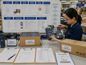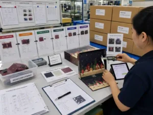
Quick answer: Brand colors are matched across coated, uncoated, and textured paper by controlling artwork settings, comparing physical proofs, measuring color results, and approving the final paper surface before production. The same ink formula can appear different because paper brightness, absorbency, texture, and finishing layers change how colors are perceived. A reliable process combines preflight checks, sample validation, and documented approval records.
Why do brand colors change between coated, uncoated, and textured paper?
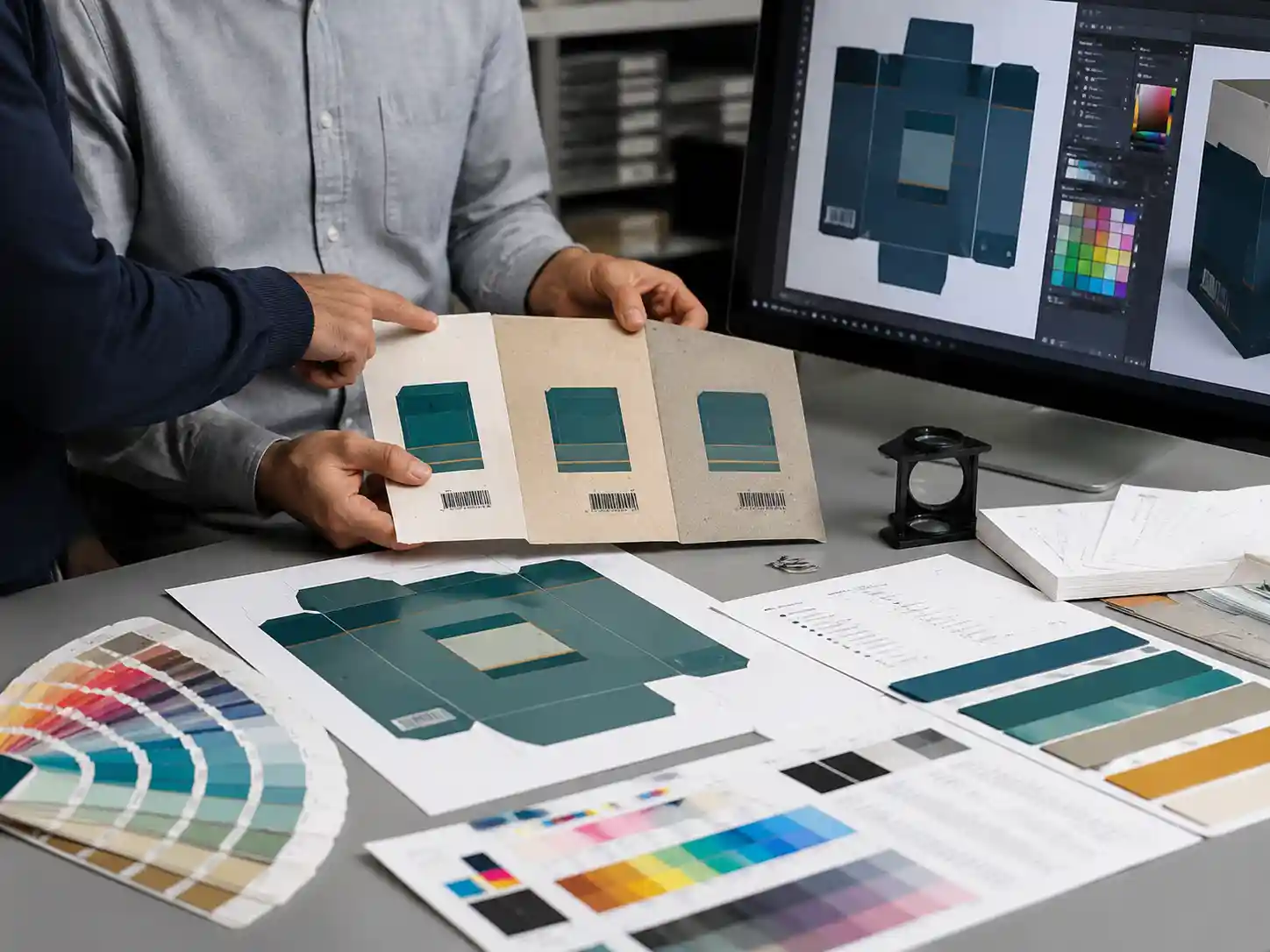
Brand colors change because each paper surface reflects and absorbs ink differently. Coated paper usually provides a smoother surface and sharper color appearance, while uncoated and textured papers can reduce color intensity or create visible variation because ink interacts with the paper fibers and surface structure.
For custom advent calendar boxes and seasonal paper packaging, color matching must consider the actual production material rather than only the digital artwork preview. A color that looks correct on a monitor or coated proof may not produce the same visual result on a natural or embossed paper stock.
What factors affect printed color appearance?
- Paper brightness and base color: warm or natural paper tones can shift neutral colors and light brand colors.
- Surface coating: coated sheets often produce cleaner details and higher color density.
- Paper texture: embossed, linen, or specialty textures can scatter light and change perceived shade.
- Finishing layers: lamination, varnish, foil, and spot UV can change gloss and visual contrast.
- Printing process settings: ink coverage, machine calibration, and production conditions affect consistency.
How should teams prepare artwork before matching brand colors?
Artwork preparation should begin with a controlled preflight review. The color decision is easier to manage when packaging files clearly separate design elements, printing layers, and production requirements.
Which artwork elements should be checked?
- Confirm CMYK, spot color, and special color layers are correctly separated.
- Check dielines, safe areas, and bleed zones so color-critical graphics are not affected by cutting or folding.
- Review barcode areas and multilingual copy to ensure color choices maintain readability.
- Confirm finishing layers such as matte lamination, gloss coating, foil, or emboss effects are shown separately.
- Verify that linked images and color profiles are correctly embedded before proof production.
Giftpackpro works with packaging files through structured artwork preparation and production review. Buyers can also review related custom advent calendar box services when planning packaging projects that require controlled printing and finishing coordination.
How do you compare colors across different paper stocks?
The most reliable comparison uses physical printed samples made with the intended paper stock and finishing method. Digital screens are useful for design review, but they cannot fully represent paper texture, ink absorption, or surface reflection.
What evidence should be reviewed during color approval?
- Printed proof samples using the selected coated, uncoated, or textured paper.
- Reference color targets such as approved brand color specifications or physical color guides.
- Side-by-side comparisons under consistent lighting conditions.
- Measurement records when color accuracy is critical for repeat production.
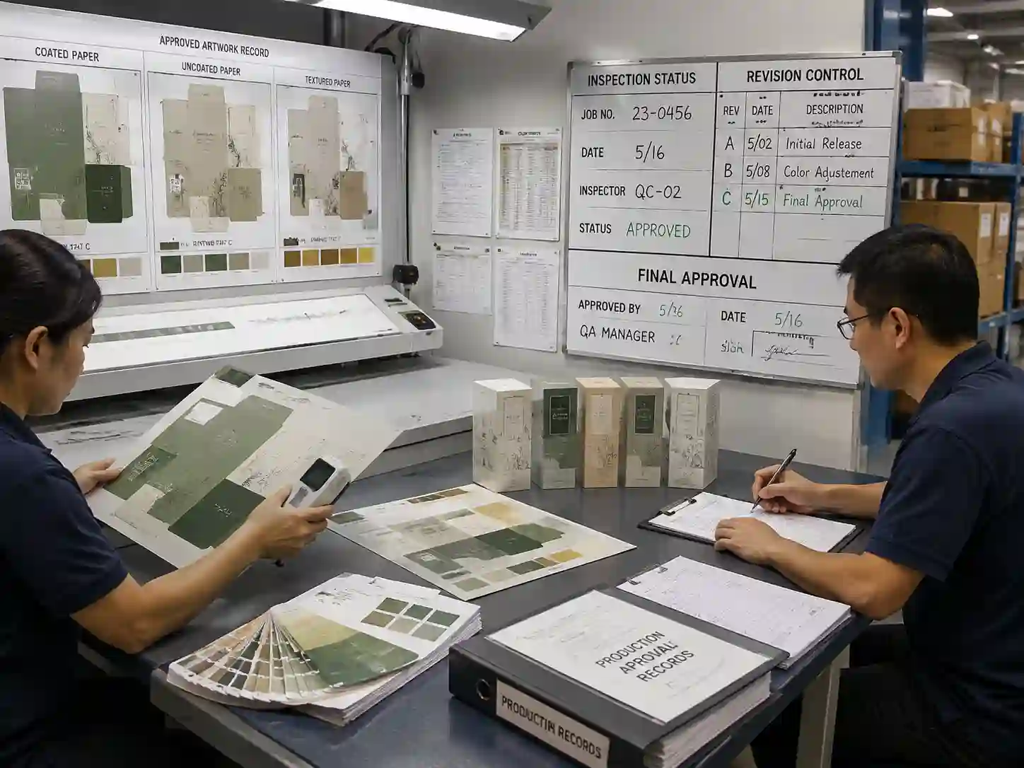
- Approval records showing the selected paper, finishing method, and accepted sample version.
| Paper type | Typical color behavior | Recommended control point |
|---|---|---|
| Coated paper | Smoother surface with stronger color definition | Confirm ink density and finishing effect |
| Uncoated paper | More absorbent surface with softer appearance | Review color shift and paper tone influence |
| Textured paper | Surface pattern may affect reflection and consistency | Approve physical samples before bulk production |

How do suppliers control color differences during production?
Production color control depends on maintaining approved references throughout manufacturing. The approved sample becomes the comparison standard for printing checks, finishing review, and final inspection.
What production checks help prevent color problems?
- Compare production sheets against approved proof references.
- Check that the correct paper stock and finishing materials are used.
- Verify artwork revision numbers before printing.
- Inspect large color areas for uneven tone or visible variation.
- Record approval decisions for future repeat orders.
Project recommendations vary depending on the color sensitivity, paper selection, printing method, and finishing structure. Some projects may require more detailed color measurement, while others may rely mainly on approved physical references.
What should buyers approve before final color production?
Buyers should approve the complete visual combination of artwork, paper, printing, and finishing rather than approving color alone. A brand color is only meaningful when reviewed on the final intended packaging surface.
Approval example
- Artwork approval: Confirm final dielines, color layers, text, and barcode placement.
- Material approval: Confirm coated, uncoated, or textured paper selection.
- Sample approval: Confirm printed sample appearance under agreed review conditions.
- Production approval: Confirm inspection records match the approved reference.
What is the preflight checklist for brand color matching?
- □ Paper stock selected and physically reviewed.
- □ Color layers separated correctly in artwork files.
- □ Dielines and safe areas checked.
- □ Finishing effects reviewed separately.
- □ Physical proof compared with brand references.
- □ Final approval records completed before production.
FAQs about brand color matching on paper stocks
Can the same CMYK values produce the same color on every paper?
No. The same CMYK values can appear different because paper surface, absorption, and finishing affect the final appearance.
Should buyers approve a digital proof or physical sample?
For color-sensitive packaging, a physical sample on the intended paper stock provides a more reliable approval reference.
Does textured paper always create more color variation?
Textured paper can create more visual variation because the surface changes how light reflects from printed areas. The actual effect depends on the texture and printing method.
How can packaging teams improve color consistency?
Consistent brand color matching requires early material decisions, accurate artwork preparation, physical proof review, and documented approvals. By treating paper selection and printing conditions as part of the color system, packaging teams can reduce unexpected differences between design files and finished boxes.
For projects requiring custom structures and controlled print execution, buyers can request a custom quote and provide artwork, paper requirements, and finishing details for review.